One of my favorite parts about making cards is pairing colors together. I tend to use more vibrant, bold colors and patterns than soft and pastel. Everyone is drawn to their favorites, but it’s good to get out of your comfort zone once in a while. If you are looking for inspiration on what colors work with other colors, I suggest looking at home decor magazines. Magazines employ color stylists to study the latest color trends each season (so they know what they are talking about).
The magazine Better Homes & Gardens includes a Home Color section in each month’s magazine with several staged rooms in that month’s color picks, https://www.bhg.com/decorating/color/. They may not use exact Stampin’ Up! colors, but their colors match pretty closely. Stampin’ Up!, like the magazines and home decor world, studies all the color trends each year. Did you know Stampin’ Up! rolls out 5 new colors called “In Colors” each year to stay up on these trends? The introduction of these new colors helps keep the Brights, Subtles, Regals and Neutral Collections fresh.
I took a photograph of one of the color combinations to show you. This one was in the February 2019 issue of Better Homes and Gardens: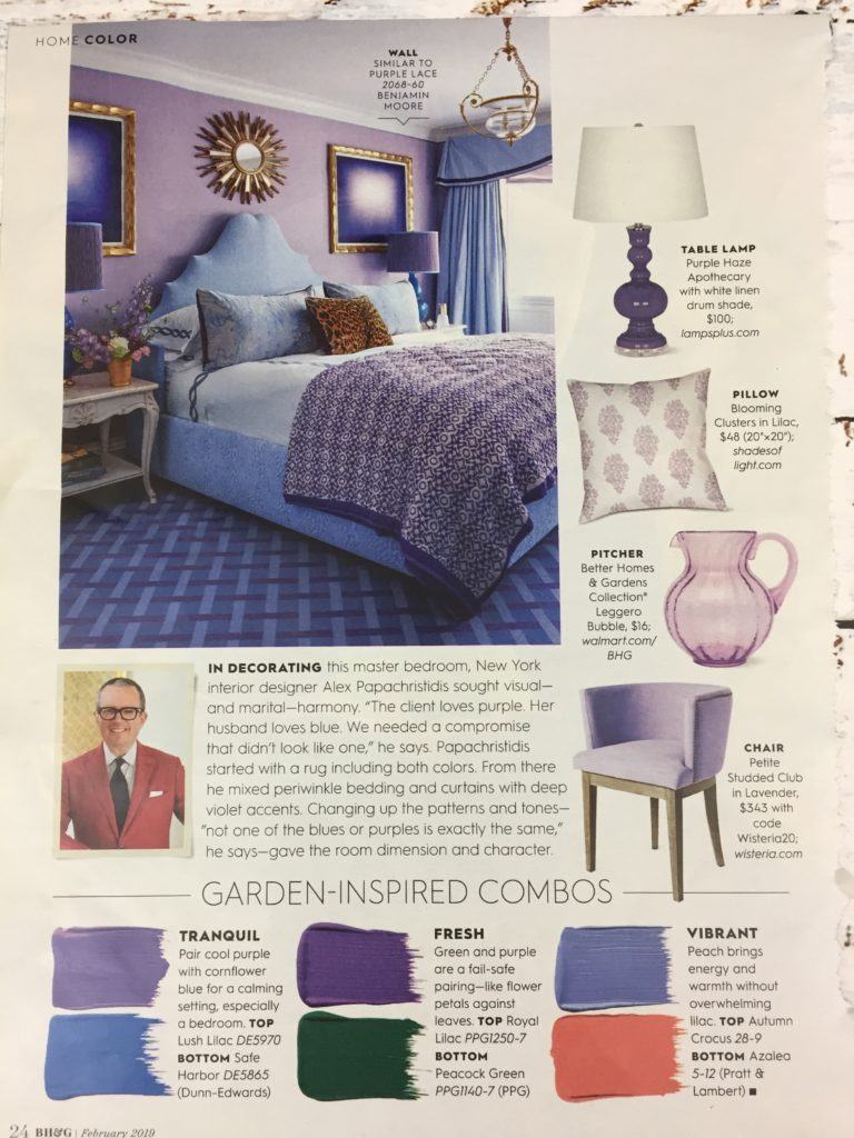
This photo is my representation of the above BH&G colors in Stampin’ Up! card stock:
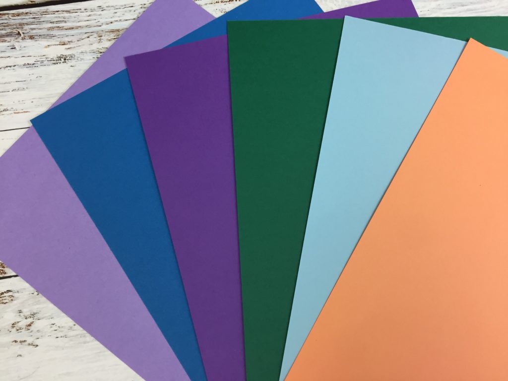 Color names from left to right: Highland Heather, Pacific Point, Gorgeous Grape, Shaded Spruce, Balmy Blue and Grapefruit Grove (an In Color).
Do you see how you can match up Stampin’ Up! colors to the ones in the magazine? This is because Stampin’ Up! takes pride in their colors and stays up on trends. I don’t think I would have thought of this color combination up on my own, but I really like it. To me, it has an under the sea feeling (even though BH&G called it Garden-Inspired).
This is the card I designed to using this color palette. I didn’t use all of the colors because that would have been way too busy. But the idea of the collection is there.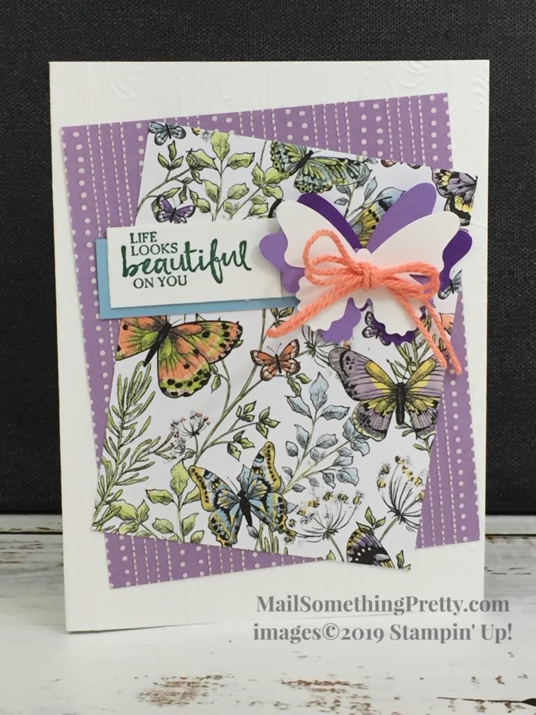 I focused my card on the Highland Heather and added bits of Balmy Blue, Gorgeous Grape and Grapefruit Grove. I stamped the words with Shaded Spruce. You can get this beautiful Botanical Butterfly paper for free during Sale-a-bration with a purchase of $50 in products. It is beautiful paper and on the reverse side has all different black and white patterns.
Keep your eyes open for magazines and the colors they use. My chiropractor encourages me to take as many as I want because they keep piling up in his office. I use them for color inspiration (and maybe a few recipes).