I was lucky enough to preview the new 2016/18 InColors (because I made cards for the OnStage Display Board) and now I am able to share them with you. I am in love with them! 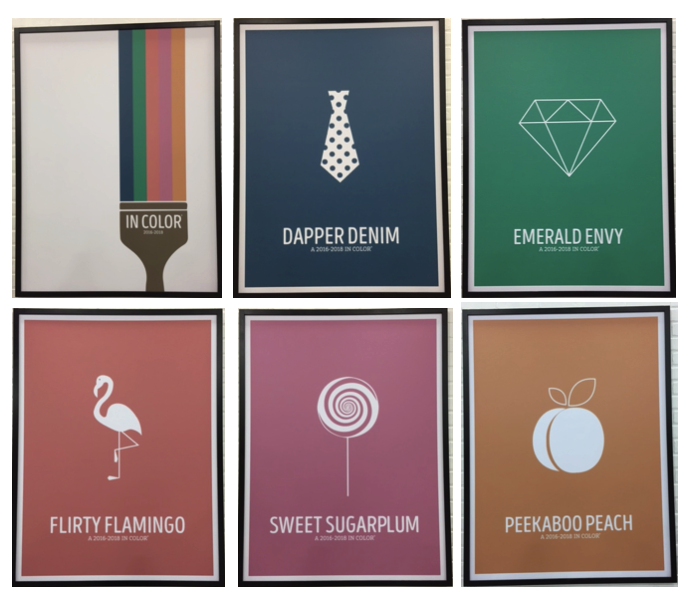 Keep in mind, these are photographs of the printed colors from an OnStage display. The true colors are more colorful and beautiful.
 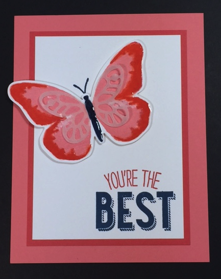 While making my samples, my favorite color pairing was Flirty Flamingo with Watermelon Wonder. What do you think? I just love the simplicity and boldness of the colors on this card. The Flirty Flamingo and Watermelon Wonder complement each other so well and the contrast of the Dapper Denim just makes it all pop.
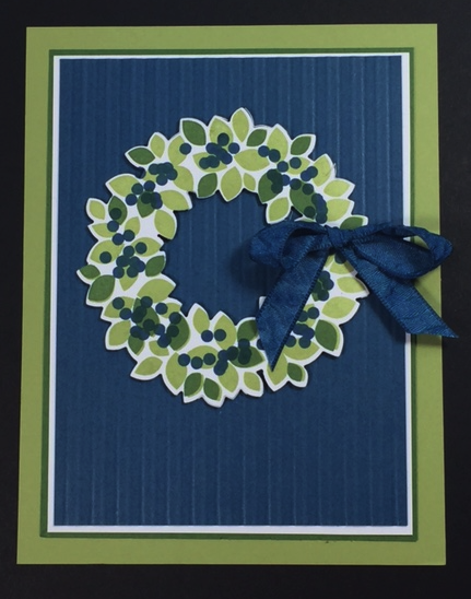 This card is a little more subtle in it’s contrast, but the greens (Pear Pizzazz and Garden Green) complement the Dapper Denim beautifully. Doesn’t it just look like blueberry season? The new ribbons are beautiful to work with.
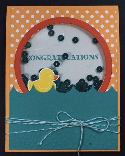 A popular favorite at OnStage was the Peek-a-boo Peach. The great thing about this color is you can make it bold or subtle depending on it’s pairing. I chose to make it bold here by pairing it with Bermuda Bay and Tangerine Tango and a nice, bright Daffodil Delight rubber ducky. Shaker cards will be so much easier to make now with the long foam adhesive strips.
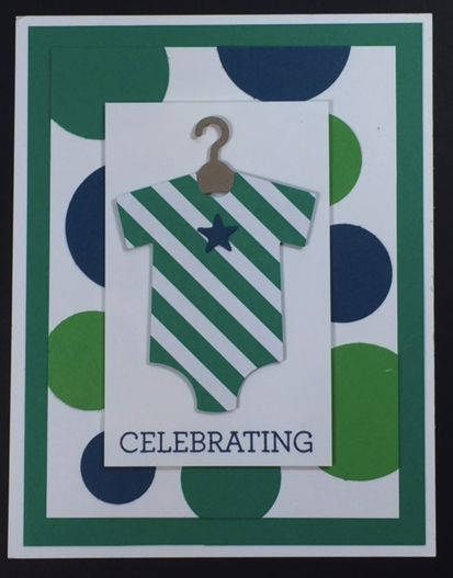 Emerald Envy is definitely a bold color, but a great bold color. Here I have it paired with Dapper Denim and Cucumber Crush and I think they work beautifully together.
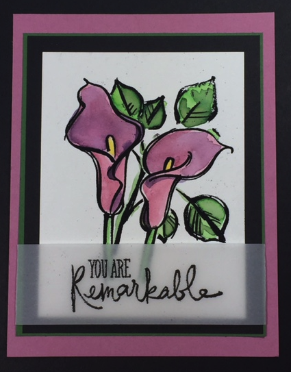 My last sample for the day is Sweet Sugarplum. It’s so nice to have another purple in our lineup! It’s a soft purple, but not pastel. I can’t wait to see all the color combinations that people will come up with. Here, I paired it with some green combinations and the dramatic black.
Leave me a comment and tell me what your favorite new InColor is!